At Strategically, an expert content writing service, we know when it comes to blogs — first impressions matter, and your blog's font is often the first thing readers will notice. So choosing the right font is essential to giving your blog or business website the best chance to make a good impression.
The Internet is a vast, ever-changing landscape. Your blog or website must be visually appealing and easy to read to stand out from the crowd. Choosing the right font is a critical element in achieving this goal.
There are many fonts to choose from, but which is right for your blog or website?
We are here to help you navigate the murky waters of font selection and pick the perfect typeface for your blog.


Why it's important to choose the best fonts for your blogs?
You are constantly creating content as a blogger, marketer, or website owner. And a big part of that content is text. So, it stands to reason that the fonts you use for your website are important.
Not all fonts are created equal. Some are more readable or stylish than others.
The right font can separate a successful blog from one that falls flat. It can make the entire website look more professional and polished or amateurish and uninviting.
It's essential to choose the best fonts for your website because they:
Create a good first impression
Have you ever been to a website with great content, but the font was so off-putting, such as a tacky Comic Sans or something similar, that you just left? First impressions matter, and this is even truer regarding fonts.
Think about it. When you meet someone for the first time, you form an opinion of the person based on their appearance, body language, voice, etc. The same is true for websites. Your website's font is like its voice. It's one of the first things people notice, which can make or break their opinion of your site.
People will likely leave your site if your font is hard to read. Too small or big fonts can make reading a chore. And if it's not aligned with your site's overall look and feel, it will stick out like a sore thumb.
When you take the time to choose fonts that complement each other and convey the essence of your service, you'll make a much better first impression.
Express your brand voice
The fonts you choose should reflect the overall tone and style of the service you offer through the website. If you're running a business blog, you'll want to avoid playful or quirky fonts. But you can afford to be a little more creative with your font choices when it's a personal project.
Serif fonts (like Times New Roman) are traditional and classic. They're often seen as trustworthy and reliable, so you may want to use them in a news website or legal business.
The sans-serif family (like Arial) contains clean-looking modern fonts. You may want to use them in your business websites like digital marketing, lead generation, or content writing service.
Fonts like Pacifico, Lobster, and Allura are script fonts that ooze elegant and romantic vibes. These common script fonts will look good on websites related to creative services. Similarly, display fonts, such as Asthetik, Febre, or Margaret, are attention-grabbing and make a statement.
Make sure your fonts are consistent with the message you're trying to communicate with your service.
Affect your readers' emotions
Believe it or not, your font choice can influence how your readers feel about your content. If you want to convey a feeling of excitement or urgency, use bolder and louder fonts to grab their attention. But when your goal is to make your audience feel relaxed and entertained, use softer, more playful fonts. The right font can make all the difference in how your content is received.
For businesses, it's critical to consider the emotional impact of fonts when creating marketing materials, websites, and other communications. After all, the goal is to create a positive emotional response in your audience that will lead to conversions.
For example, have you ever noticed how a lot of romantic novels tend to use cursive fonts? There's a reason for that. Cursive fonts are known to be more emotionally charged than other fonts, which makes them perfect for stories that are trying to stir up some passion.
On the other hand, if you're looking for a font to capture the audience's focus, you might want to try sans serif fonts. The sans serif typeface is known for being clean and easy to read, which makes the fonts ideal for academic texts or business documents.
Determine the reading time and comprehension
The font choice can affect how easily people can read something.
Yes, your typeface can impact your reader's ability to read and comprehend your content. Studies have shown that a person can read 35% faster with maintaining comprehension when the font is suited to their preferences.
So, what does this mean for you and your website? It means that an easy-to-read font can make a big difference in how well your readers engage with your content.
Some fonts are designed to be easy to read, while many fancy font variants are hard to decipher. If your goal is to have readers stay on your page and digest the content without extra effort, use some popular sans serif fonts or something similar.
Help with expressing professionalism
If your blog or website looks like it was put together by a ten-year-old, most people will assume that your content is just as amateurish. So, you need to put together a sleek, polished, and professional website to make people give your content a chance.
And that's where choosing the right font comes in.
Here are a few tips for using typography to express your professionalism:
- Use a simple font with enough white space to be easy on the eye.
- There should be enough space between the lines, so a reader's eyes have room to move across.
- Choose font pairs from the same typeface family to maintain visual cohesion. For example, combining two serif fonts or sans serif fonts will create a more unified look.
- Use different fonts (but with similar features) in the blog body and headlines to maintain a better hierarchy.
- The body font should be smaller than the headings.
Follow these tips and make your website look more professional and trustworthy with the right typography.
Make a website stand out from the crowd
Making your blog stand out with millions of competitions online can be challenging. But one way you can do that is by choosing a font set that expresses your brand voice.
Every business has a story to tell, and the right fonts can help tell that story in a compelling way. They can communicate the personality of a brand and help create a visual identity that is unique and memorable.
When choosing fonts for a website, it is crucial to consider the overall tone and voice of the site. The fonts should be legible, easy to read, and reflect the brand's personality.
The fonts should also be used consistently throughout the site. It means using the same font pairs for headlines, body text, and navigation. It helps with brand recall, and the audience will also remember it on other platforms.
15 popular options for the best fonts for blogs
The Internet is full of terrible fonts. You know the kind—the blocky, all-caps, Comic Sans-Esque eyesores that make you cringe every time you see them. But don't despair! There are still plenty of good fonts out there.
Google fonts for blogs are the most popular. Your WordPress theme may also have some default font options. However, you can use any fonts in your WordPress website since the platform supports almost all typefaces.
Here are the best Google fonts and other options for blogs and websites:
Roboto font
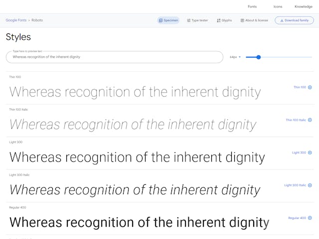
Roboto is arguably the most popular option since the mighty Google uses it as the system font. It belongs to the sans-serif family and features a neo-grotesque style.
The font has an appealing geometric design that makes it perfect for use in headlines and body text. Its clean lines and lack of flourishes give it a fresh, modern look that works well on both the web and print media.
Robot's sleek, easy-to-read design makes for a smooth reading experience, and the familiar lettering is instantly recognizable to Internet users.
The font was designed by Christian Robertson and released by Google in 2011. The family includes a variety of weights and styles, making it a versatile tool for designers.
Best pairs for the Roboto font: Open Sans, Robot Slab, Oswald, and Montserrat.
Oswald font
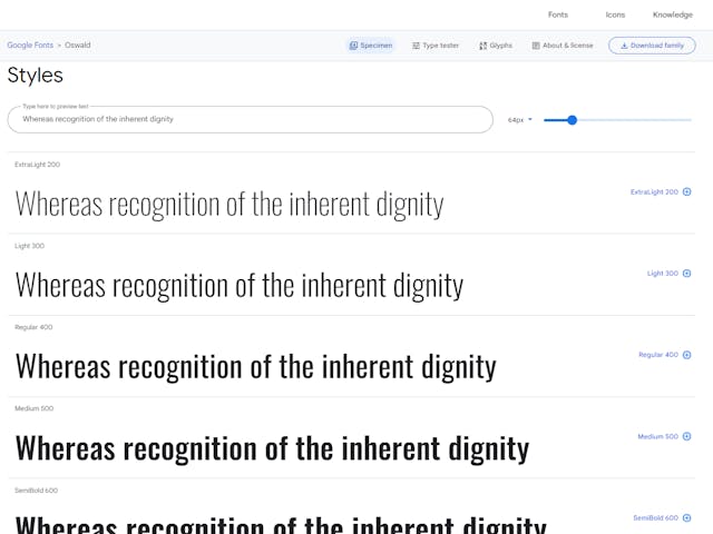
Oswald is one of those unique fonts that can be both at home in a modern design or hearken back to a more classic feel. It's perfect for when you want to add a touch of elegance to your work without being overbearing.
The font belongs to the sans serif typeface, and designer Vernon Adams developed it in 2011 by taking inspiration from Alternate Gothic. It has a tall x-height and strong character shapes. Its height and weight make it perfect for headlines and other impactful text, while its light and regular variants are great for long blocks of text.
Best pairs for the Oswald font: Roboto, Merriweather, Arial, and Quicksand.
PT Sans font
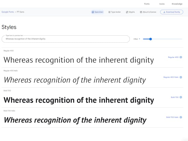
There are many fonts out there vying for attention, but PT Sans is a font that is definitely worth your attention. Based on the 20th-century Russian sans serif style, the font has its unique charm because of adopting design cues from the modern humanistic typeface.
According to looks, PT Sans seems similar to the Open Sans font but is more suitable for headings and titles because of its smaller X-height and narrower width. And because it comes in a wide range of weights, from light to bold, you can use it for everything from headings to quotes.
Best pairs for the PT Sans font: Open Sans, PT Serif, Poppins, and Crimson.
Open Sans font
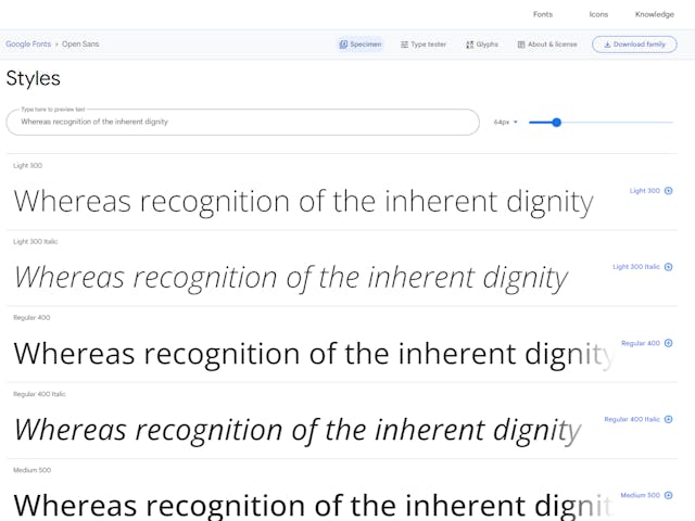
Open Sans is a genuinely versatile font. Its clean lines and easy-to-read lettering make it perfect for use on blog bodies and large chunks of text. The fact that it works across devices makes it even more ideal for today's online world.
The font is similar to PT Sans but has a taller X-height and a more open nature because of the general spacing. Its larger counters and wider glyph widths increase the readability even in small sizes.
Open Sans is a popular choice for design-focused blogs and websites with dark mode for its excellent legibility.
Best pairs for the Open Sans font: PT Sans, Montserrat, and Alegreya.
Raleway font
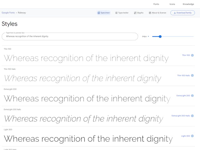
Raleway is a stylish, modern font. It has become popular among bloggers and website owners for its distinct appearance. This font was designed by Matt McInerney, the same person who created Orbitron–one of the most popular fonts used today.
Raleway's defining characteristics are its overbite "e" and bouncing numerals, which add a touch of personality to the font. Despite these quirks, it remains a highly functional and sharp-looking font. Its clean lines give it a stylish yet professional appearance, making it ideal for various uses.
The font was originally designed as a single, thin weight. However, in 2012, two designers extended it into a 9-weight family, making it suitable for headings and subheadings.
Best pairs for the Raleway font: Playfair Display, Open Sans, Barlow, and Calibri.
Oxygen font
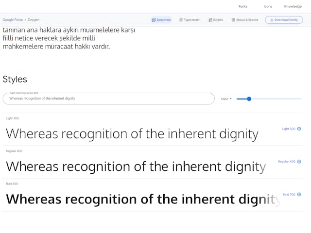
When the Oxygen font was first released in 2011, it was praised for its simple, clean design. It remains one of the most popular fonts for web and print design.
While the font's straightforward appearance makes it ideal for digital media, mobile devices, and computer screens, it's also suitable for printed materials. Its three body weights make it versatile enough for a website's sidebar and body texts.
In addition to its professional look, Oxygen's longer and thinner letters can help give your website a sophisticated edge. Whether designing a new website or freshening up an existing one, Oxygen is an excellent choice for any project.
Best pairs for the Oxygen font: Open Sans and Oswald.
Playfair Display font
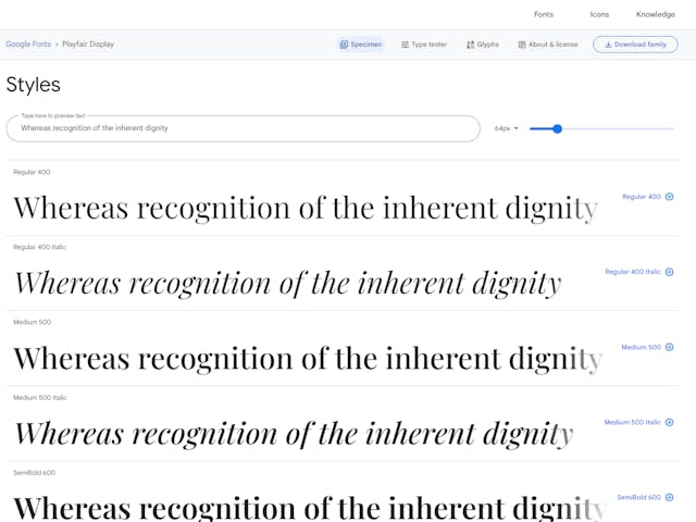
The designer of the Playfair Display font, Claus Eggers Sorensen, wanted to create a font that would be easy for people to read online. And he wanted to design a font that would be versatile enough to be used for various purposes.
The font has small embellishments and thin hairlines on the tips of its letters. These embellishments help to make the letters more readable. The Playfair Display font also has high contrast between its thick and thin strokes, making it highly legible to the readers.
One of the best things about the Playfair Display font is its versatility. It can be used for both body text and headlines, thanks to its different thin and bold versions.
Best pairs for the Playfair Display font: Georgia, Raleway, and Open Sans.
Ubuntu font
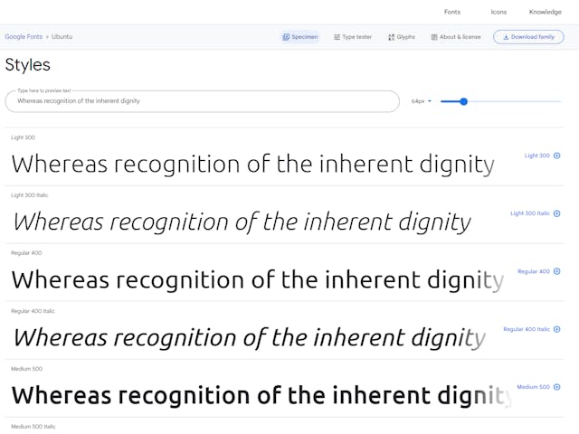
Are you a fan of the Ubuntu operating system? If so, you're sure to love this font! This cool, tech-centric font is perfect for blogs and websites that want to convey a modern, cutting-edge feel.
The Ubuntu font family covers a wide range of thirteen fonts and belongs to the sans serif typeface. This font has eight weights, making it an excellent option for body texts and graphic design projects. Whether you're looking to add a touch of personality to your website or create stunning visuals for your latest project, this versatile font is sure to do the trick.
So if you need a fresh, modern font, be sure to give the Ubuntu font a try. You won't be disappointed.
Best pairs for the Ubuntu font: Lato, Open Sans, Merriweather, and Oswald.
Source Sans Pro font
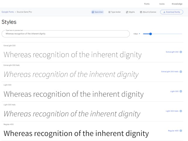
For those in search of a clear and legible typeface for their next web or blog project, look no further than Source Sans Pro. This user-friendly sans-serif font was designed specifically for digital interfaces, and its clean and modern design makes it an ideal choice for various applications.
While its simple shapes may, at first glance, seem too plain, the subtle details in Source Sans Pro give it a level of sophistication hard to find in many other fonts.
The font has six weight variations, so you can easily find the perfect match for your project. And because it was specifically designed for use in Adobe's user interfaces, it's ideal for websites and blogs. Source Sans Pro is easy to read, even in smaller sizes, and it's an excellent choice for long-form content.
Best pairs for the Source Sans Pro font: Work Sans, Courier New, Open Sans, and Industry.
Allerta Stencil font
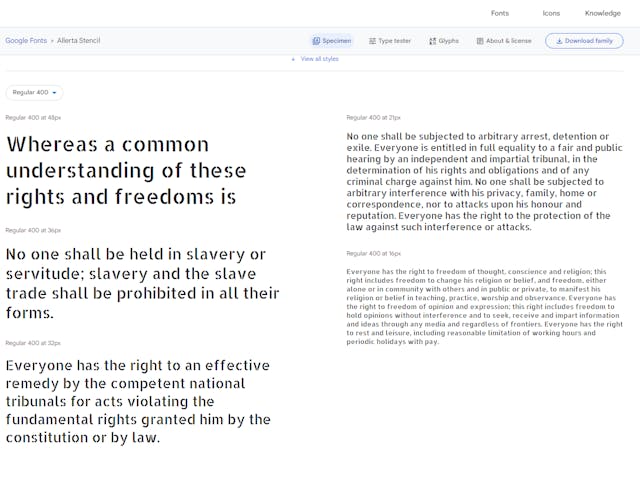
It's one of the common decorative fonts where each glyph has been uniquely designed to make them stand out. Designer Matt McInerney developed it for use in posters and signages.
All the letters in the font are separate from each other, making this an excellent font for headings and titles. The font is legible from a distance, making it a practical choice for notices and social media content.
Best pairs for the Allerta Stencil font: Special Elite Typeface.
Lato font
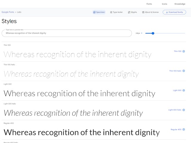
Lato is an excellent choice for blogs and websites that want to convey a feeling of warmth and professionalism. The semi-rounded letters give a sense of approachability, while the solid structure conveys stability and seriousness.
It's a popular Google font that millions of websites have been using since its release in 2015. The semi-rounded letters are easy on the eyes and highly readable without sacrificing aesthetics. Whether you're running a personal or a business blog, Lato is a great font.
Best pairs for the Lato font: Merriweather, Yellowtails, and Cardo.
Merriweather font
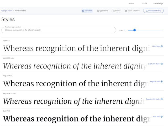
When it comes to on-screen reading, few fonts can compare to Merriweather. The font is legible with its tall X-height and heavy serifs, making it ideal for blogs and websites.
There are eight styles to choose from, and the bold variations are suitable for titles and headings. Merriweather works well for body texts, but long posts could strain the eyes.
Best pairs for the Merriweather font: Roboto, Open Sans, Proxima Nova, and Futura PT.
Teko font
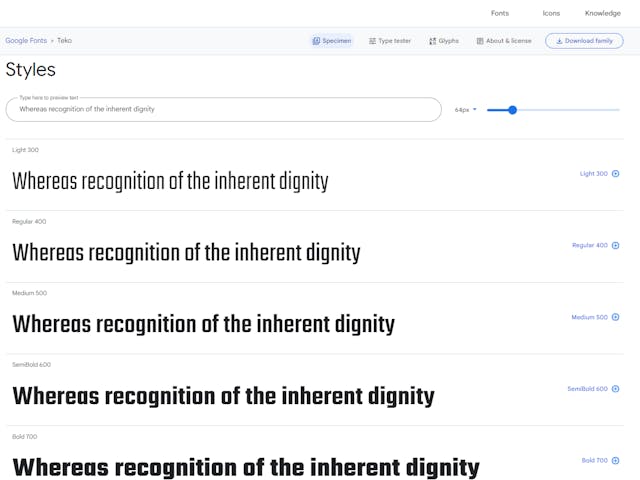
The Teko font is perfect for creating headlines that grab attention. Its simple square-like structure and low-stroke contrast make it ideal for any text you want to stand out.
One of the best things about the Teko font is that it's available in several variants. This means you can use it for all sorts of headlines or just highlight a few words. No matter what you use it for, the Teko font is sure to make your texts pop.
Best pairs for the Teko font: Montserrat
Montserrat font
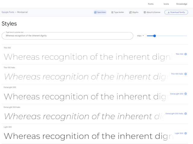
The Montserrat font is a great choice for any project that wants to evoke an urban feel. Designer Julieta Ulanovsky took inspiration for this font from the old posters and signs of the Montserrat neighbourhood in Buenos Aires.
The simple geometry and clean lines give the font a modern appeal. At the same time, the lightness of the Regular version makes it perfect for longer texts. The 2017 update by Jacques Le Bailly was a significant improvement, making the font even more versatile and user-friendly.
Best pairs for the Montserrat font: Lato, Georgia, Source Sans Pro, and PT Serif.
Bitter font
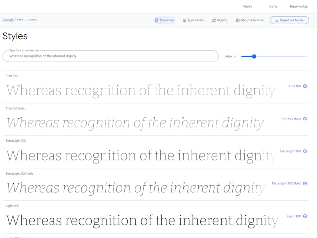
Bitter is the perfect typeface for reading on any electronic device. Its robust design is based on the pixel grid, which makes it easy to read. The large X-heights and legible character shapes make it ideal for reading long blocks of text.
The Regular style is thicker than the "regular" version of other typefaces, which can make paragraphs look a bit intense. The serifs are as thick as the strokes and have square terminals, giving the text a strong, confident look. Overall, Bitter is an excellent choice for anyone who wants a readable, stylish typeface.
Best pairs for the Bitter font: Source Sans Pro, Gotham, Helvetica Neue, and Open Sans.
Conclusion
There are few things more essential to a great website or blog than typography. The right font can make all the difference in conveying the right tone and message to your readers. When it comes to finding the perfect font for your project, the options can feel endless. But sometimes, the best option is a simple, classic font that is easy on the eyes and easy to read. Choose the font combination for your blog or website from the excellent suggestions given in this article.